Notes from a project where I tried to build an honest ensemble species distribution model, and report what the numbers actually say.
The question
In a warming climate, which regions of Norway will become newly suitable for the invasive garden lupin (Lupinus polyphyllus), and which currently suitable regions will drop out as summer temperatures overshoot the species' optimum?
This is a classic species-distribution-modelling (SDM) question. The issue is that a lot of SDM work ends up as one map, one algorithm, leaky validation, model-specific importance metrics, and future projections shown as a single clean answer. I wanted to build the more careful version.
In this project I used ~15,000 GBIF occurrences, 10 environmental predictors, four machine-learning algorithms, CMIP6 climate projections from three global climate models under two emission scenarios, spatial cross-validation, out-of-fold permutation importance, inter-algorithm uncertainty, and a Multivariate Environmental Similarity Surface (MESS) extrapolation check.
This write-up is mostly about the method, not the species. The same pipeline applies to any invasive, any region, and most ML-on-geospatial-data problems.
Data
Here are the main layers I used, where they came from, and why they matter:
- Species occurrences: GBIF (Norway), cleaned + 1 km grid-thinned to 15,350 presences (presence-only signal)
- Current climate: WorldClim v2.1 (2.5 arc-minute). Started with 19 bioclim variables, reduced to 8 after VIF < 5 (thermal and precipitation niche)
- Topography: Copernicus DEM (slope) (microclimate and local drainage)
- Soil: SoilGrids 2.0 (soil pH) (edaphic preference)
- Future climate: CMIP6 bioclim (ACCESS-CM2, EC-Earth3-Veg, CMCC-ESM2) under SSP2-4.5 and SSP5-8.5 for 2041-2060 and 2061-2080 (projections)
Random background points in presence-only modelling bias toward "accessible" locations (roads, cities) rather than "suitable" ones. I corrected for this by sampling 10,000 background points weighted by a 2-D kernel density estimate (KDE) of the presences. This way, presences and background share the same sampling bias, and the model learns environment rather than sampling effort.
Four algorithms, one ensemble
The four models in the ensemble:
- MaxEnt (elapid, LQ features, β = 2.0): workhorse for presence-only SDM
- Random Forest (500 trees): captures non-linear interactions
- Gradient Boosting (300 stumps, depth 5): similar idea, different bias/variance
- L2 Logistic Regression: smooth baseline and fast sanity check
The ensemble is the per-pixel AUC-weighted mean of all four predictions (NaN-safe so edge pixels aren't dragged toward zero). Weighting by AUC ensures the ensemble isn't diluted by a weak algorithm.
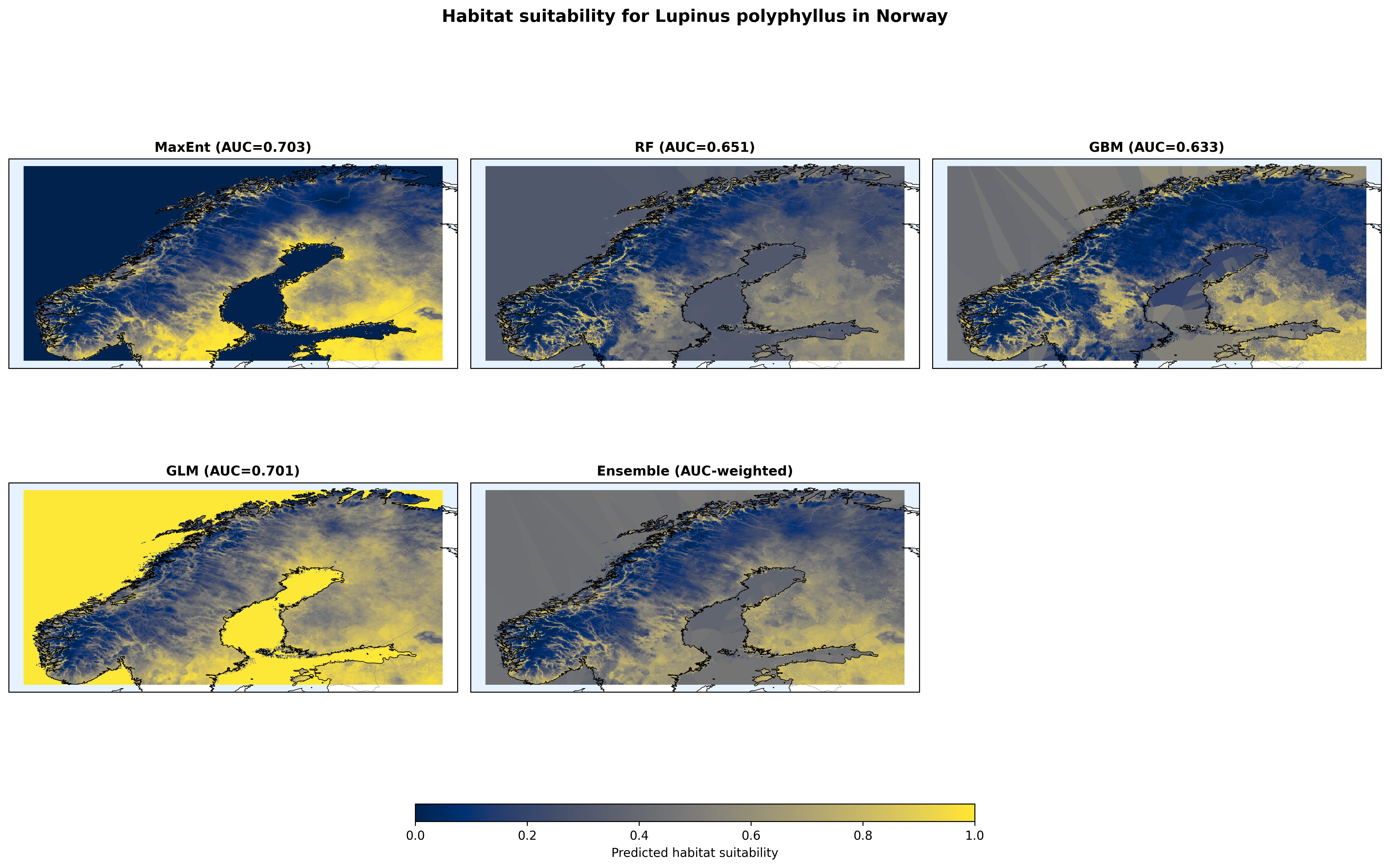
Figure 1 shows the ensemble and the four individual algorithms side-by-side. The qualitative agreement is reassuring. All four put high suitability in the coastal south and Oslo region, and low suitability in the high-altitude interior and the far north. But the absolute values disagree, and that disagreement becomes a quantitative uncertainty map later.
Why spatial cross-validation matters
If I randomly split my 25,350 points (presences + background) into 80/20 train/test, nearby points will land in both sets. Nearby points in a geographically biased dataset share autocorrelated noise. The model memorises the region rather than the environment, and you get AUC ≈ 0.85 and feel great about it.
Instead I use four geographic folds. k-means clusters the points into four spatial groups; each fold holds one entire cluster out. The model never sees the test cluster's region during training.
In my runs, random k-fold AUC comes out around 0.85. With spatial k-fold the same model gets 0.70. The 0.70 is the number I trust.
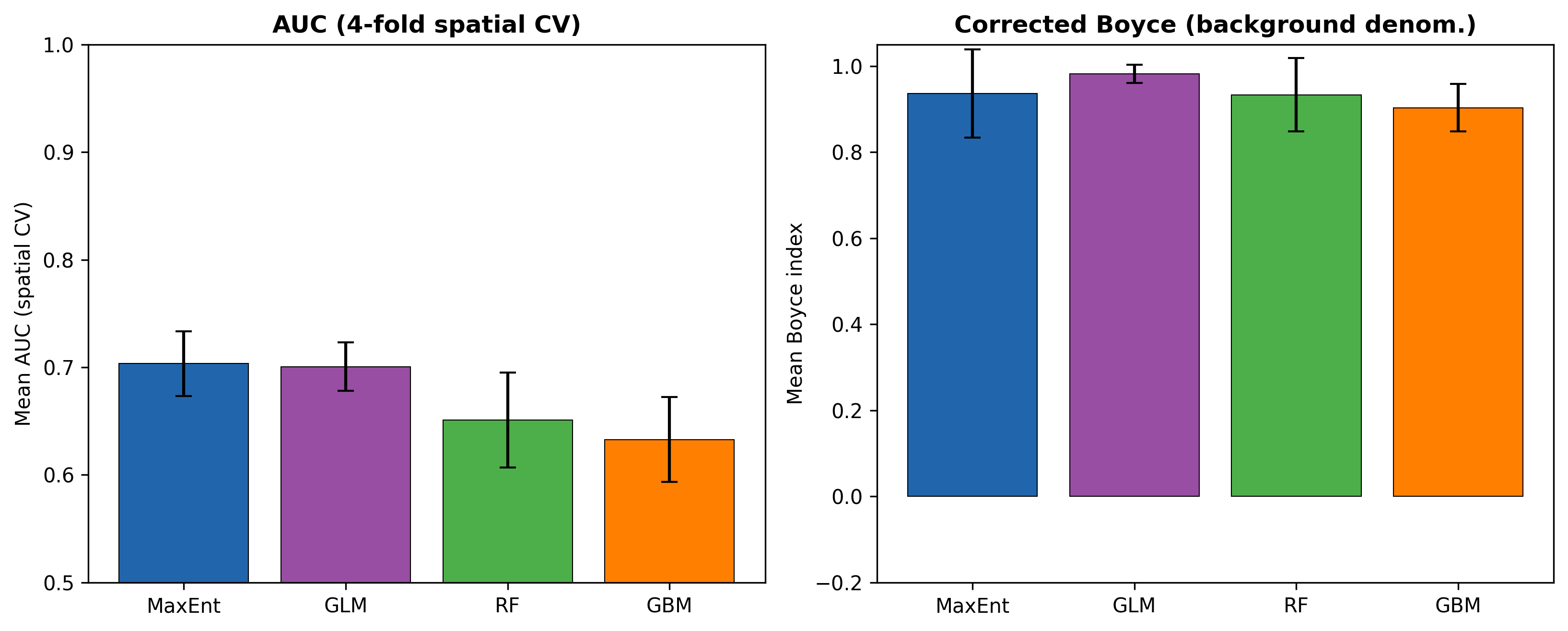
Figure 2: MaxEnt and GLM lead (AUC = 0.70), the tree-based models trail (RF = 0.65, GBM = 0.63). Interestingly, the simpler models win. It is a reminder that flexibility without a commensurate signal-to-noise ratio can overfit under spatial validation.
The Boyce index (Hirzel et al. 2006) captures calibration: are higher-suitability bins actually enriched in presences relative to background? I implemented the corrected form with background as the denominator (some implementations incorrectly use all pixels, which inflates the score). All four algorithms score 0.90–0.98, so the ranking is well calibrated even if absolute predictions are uncertain.
Which variables matter (out-of-fold)
A Random Forest's feature_importances_ attribute ranks variables by Gini decrease, but Gini is biased toward high-cardinality predictors. A soil pH variable with 200 unique values will look important even if it adds no signal. MaxEnt has its own feature-importance output, GLM has z-scores. Every algorithm has its own metric, and they disagree.
The algorithm-agnostic solution is permutation importance on held-out data. For each predictor, shuffle its values in the test fold, re-predict with a model that never saw that fold, and measure the drop in AUC. Average over 5 repeats. This is a generalisation metric, not a fit metric.
I initially computed this on the training set by mistake (the more common flavour in SDM code). Moving to out-of-fold halved the estimated importance of the top predictor and essentially zeroed-out soil pH and slope. It was a big shift.
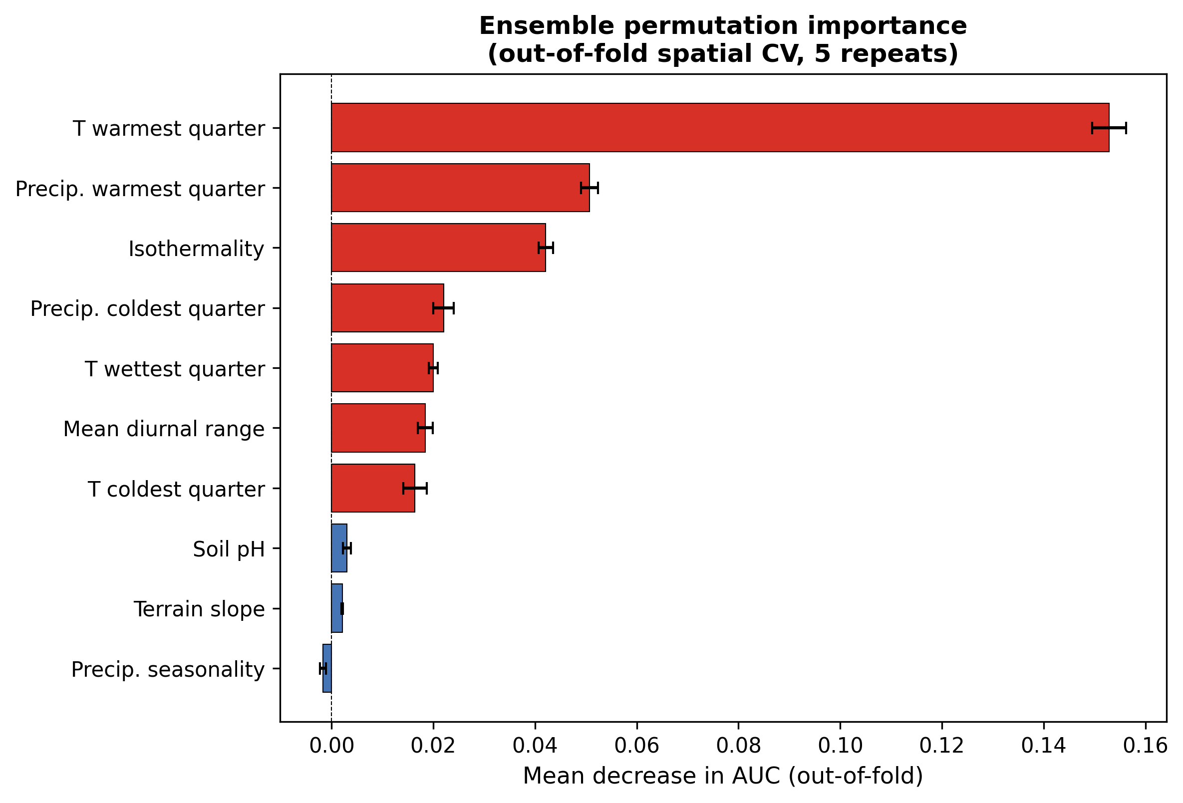
Figure 3: Growing-season temperature (bio_10) dominates. Removing it drops AUC by 0.15. Precipitation of the warmest quarter and isothermality each cost ~0.05. Soil pH and slope contribute almost nothing at the ensemble level (ΔAUC ≈ 0.003 and 0.002), even though Random Forest's Gini ranks them near the top. Algorithm-agnostic importance caught a bias that a single-model analysis would have missed.
How the model responds to each predictor
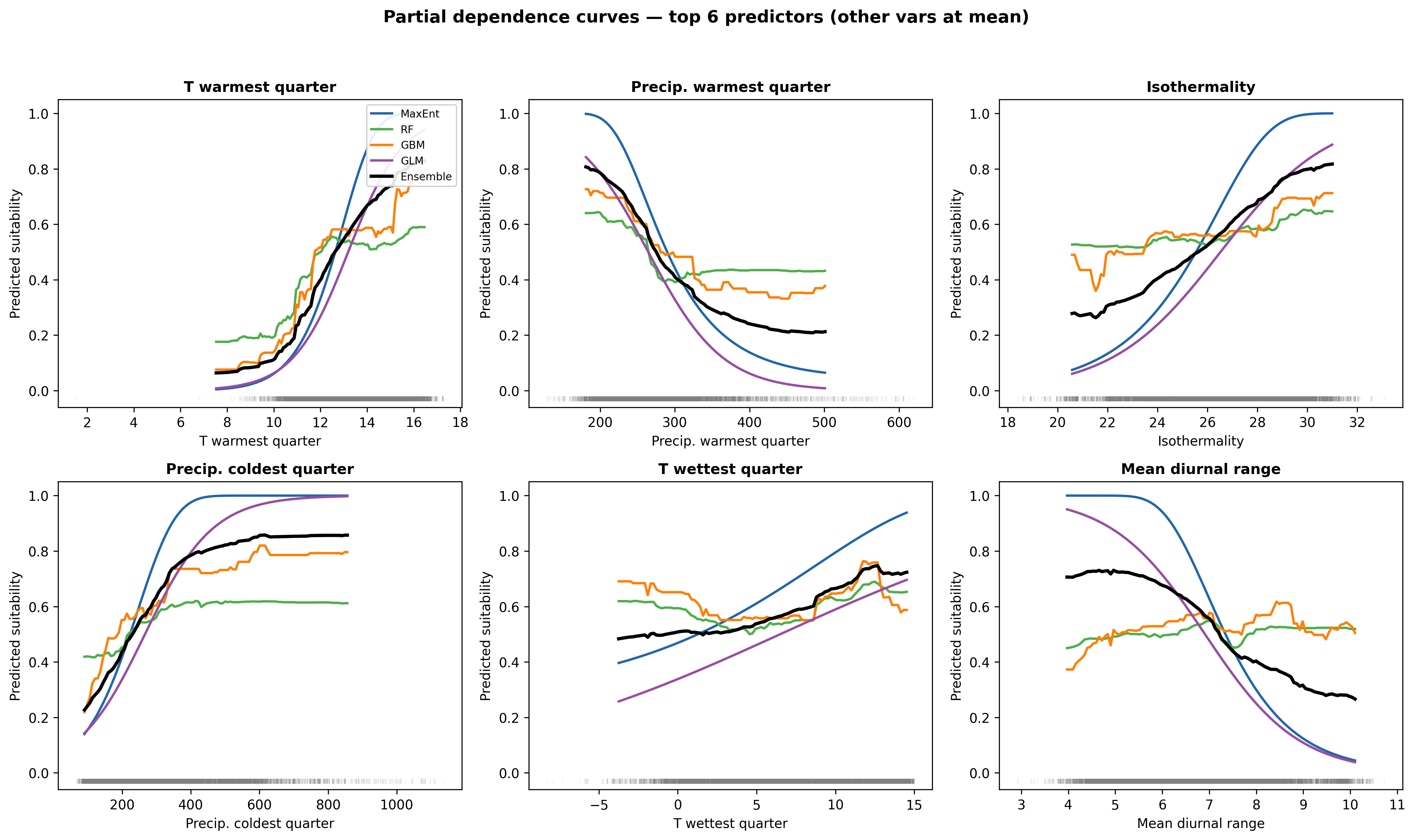
Figure 4: The response to mean summer temperature (bio_10) is sigmoidal in MaxEnt and Logistic Regression but plateaus earlier in the tree-based models. The ensemble smooths between them, producing an apparent thermal optimum around 12–14 °C. Predictions for bio_10 above ~15–16 °C sharply decline in MaxEnt. This is the mechanism that will drive the "trailing-edge contraction" in the future projections.
One caveat: partial dependence holds other variables at their mean. For highly correlated predictors (bio_10 and bio_11 are ~0.9 correlated) this represents an ecological impossibility. Accumulated Local Effects (ALE) plots would be more defensible but the interpretation is similar at first order.
Where the algorithms disagree
The four algorithms produce slightly different maps. The pixel-wise standard deviation across the four is a natural uncertainty metric: low SD means all four agree, high SD means they disagree sharply.
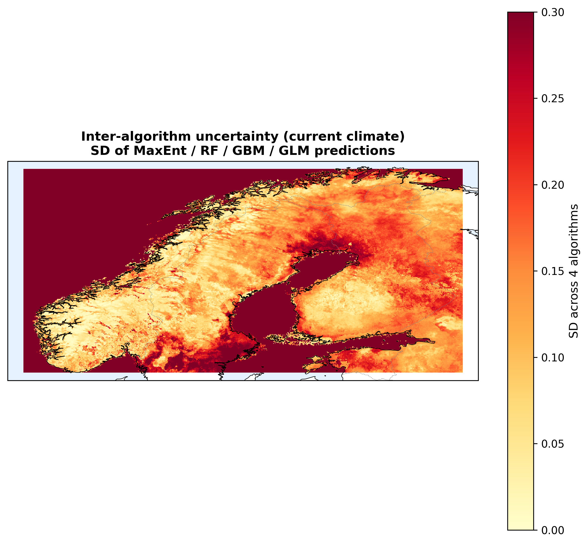
Figure 5: Agreement is high in the core range (southern coastal lowlands, where all four say "suitable") and in the far-north mountains (all four say "unsuitable"). Disagreement peaks in transitional zones, like southeastern inland and the southern mountains, which is exactly where you want a confident answer. Mean SD across Norway is 0.21, a non-trivial fraction of the 0–1 suitability scale.
If you only show the ensemble mean, you miss where the models disagree. The SD map makes that uncertainty visible.
Future projections under two warming scenarios
I projected the four algorithms onto future climate using three CMIP6 global climate models (ACCESS-CM2, EC-Earth3-Veg, CMCC-ESM2) under SSP2-4.5 (moderate warming) and SSP5-8.5 (high warming), for two time periods (2041–2060 and 2061–2080). That's 12 future rasters per algorithm × 4 algorithms = 48 projections, averaged into ensemble means.
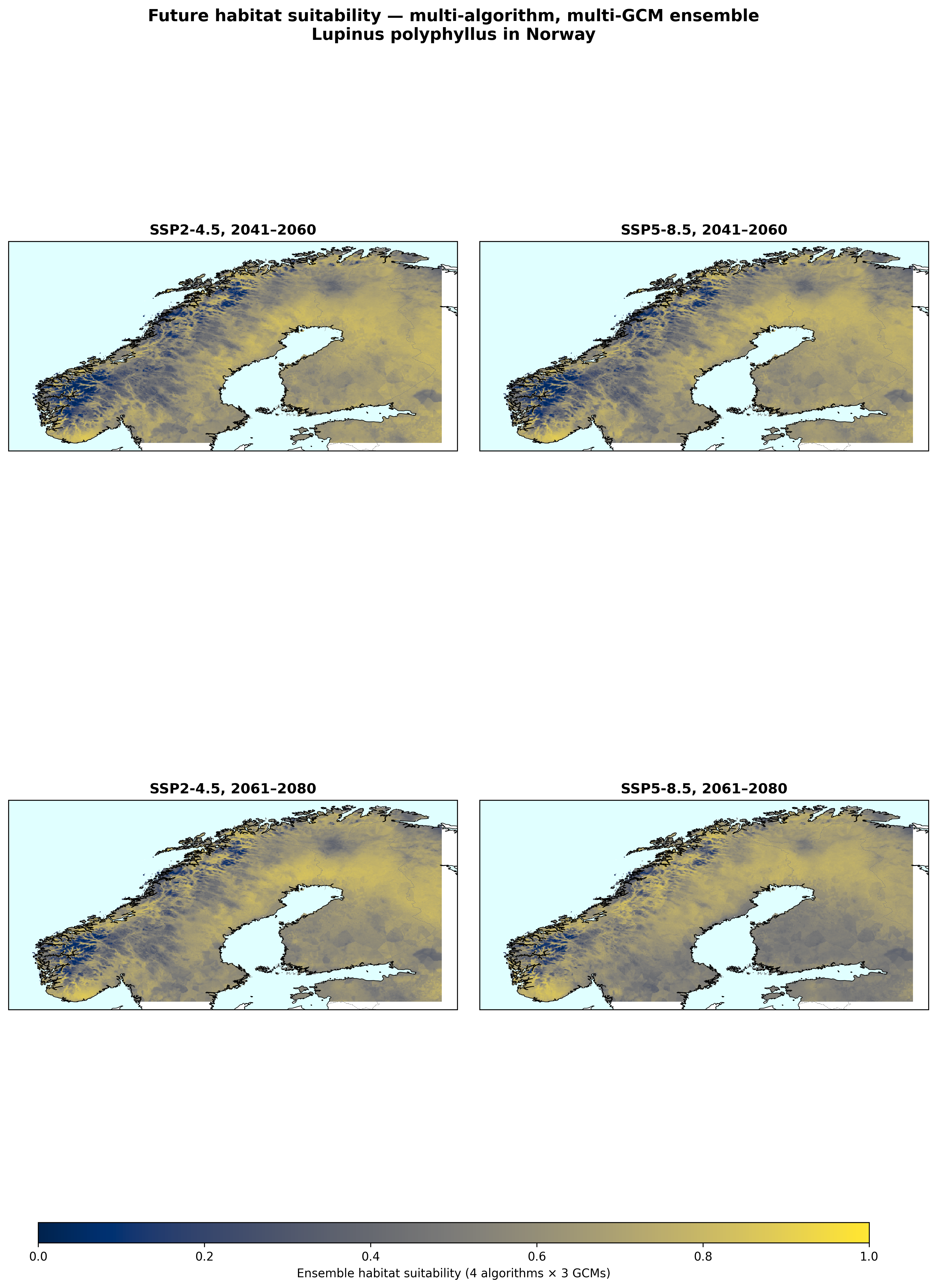
Figures 6 and 7: The dominant signal is northward expansion. Large areas that are currently too cold cross into the suitability range as summers warm. But figure 7 also shows a second, subtler signal: reds shift into the interior and north while blues appear in the south under SSP5-8.5.
Just reporting "by 2080, X% of Norway is climatically suitable" would hide this dynamic.
The gain / loss decomposition
Rather than one "% area at risk" number, I split the change into three categories:
- Gain: currently unsuitable pixel crosses into suitability
- Loss: currently suitable pixel drops out of suitability
- Net = Gain − Loss
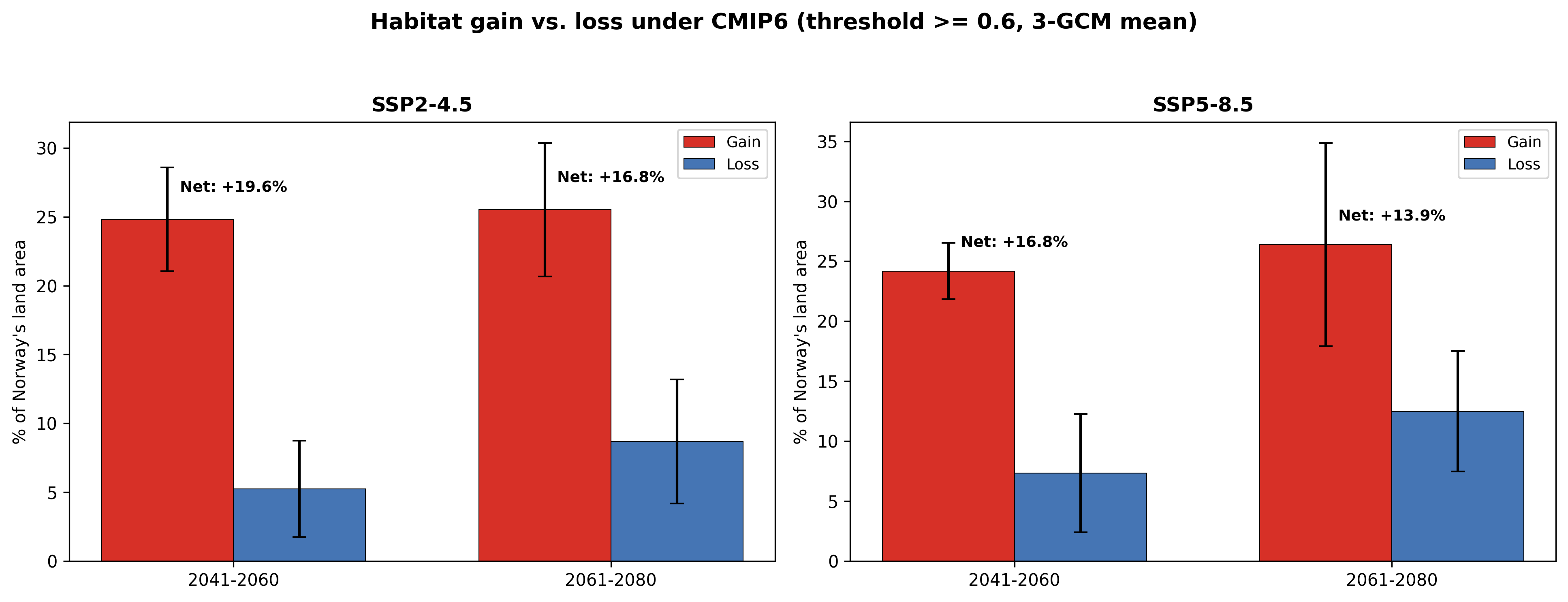
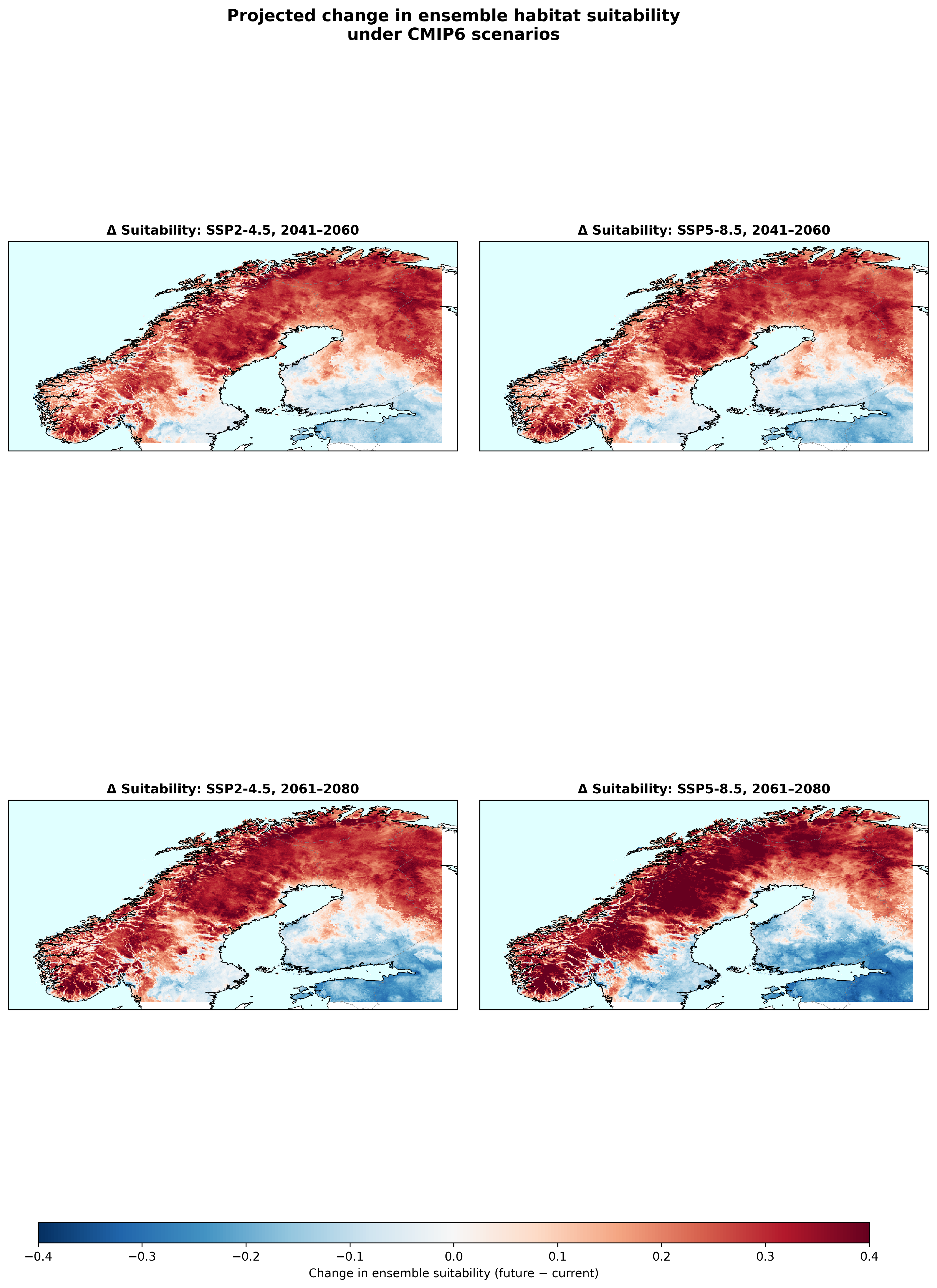
Figure 8 shows the counter-intuitive finding: net expansion is smaller under the stronger-warming scenario. Under SSP2-4.5 (2041–2060), net is +19.6%. Under SSP5-8.5 (2061–2080), net is only +13.9% even though the climate is warmer. The reason is trailing-edge overshoot: in southern coastal lowlands, summer temperatures cross the species' thermal optimum and suitability collapses.
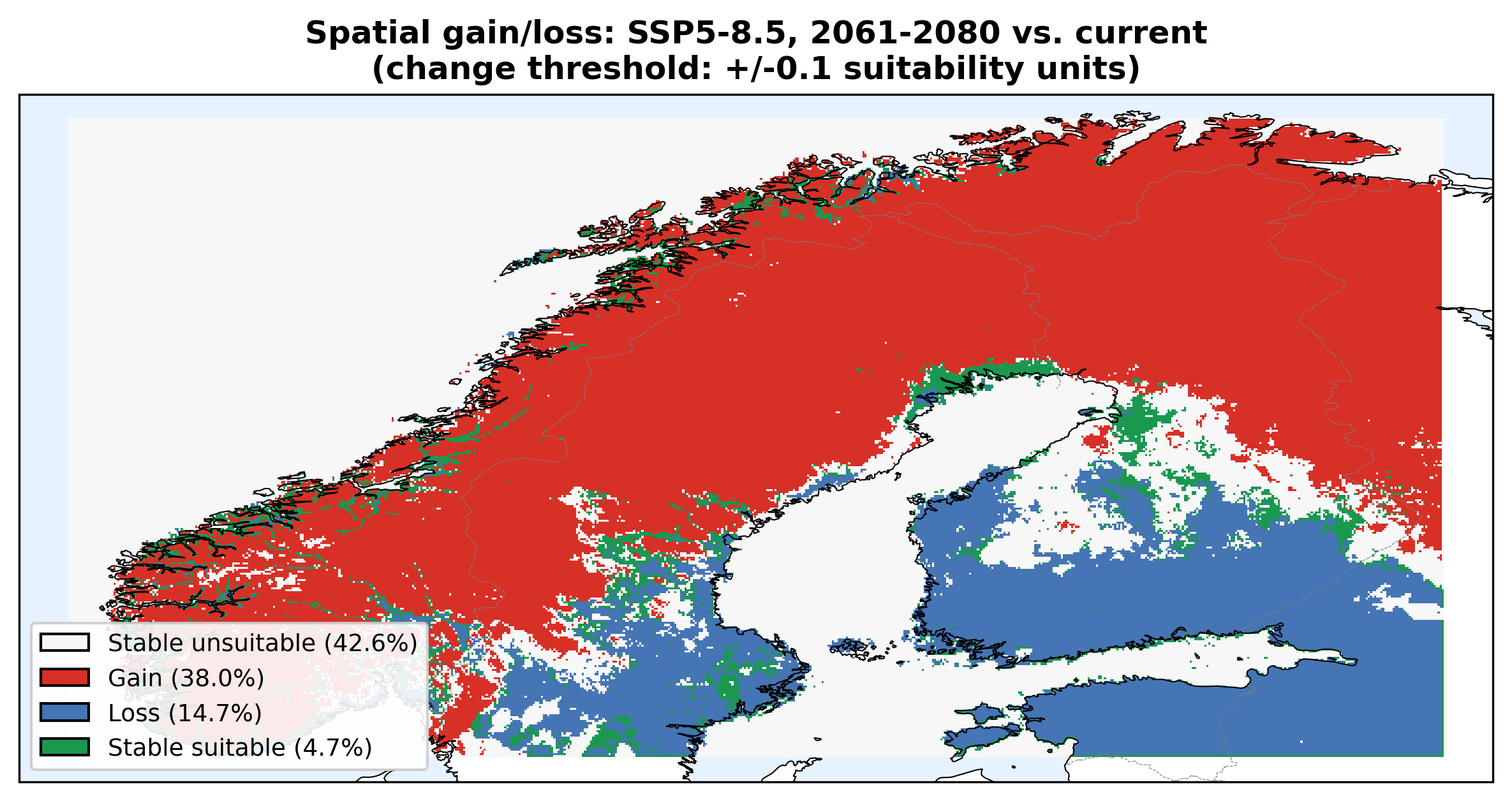
Figure 9 shows where. The geographic logic is coherent: losses concentrate in the southern coastal lowlands where temperatures overshoot; gains extend into Troms, Finnmark, and interior valleys. This is the kind of detail a "% area" headline would erase.
The honesty map: MESS
Every machine learning model that projects forward in time (or geography) is extrapolating somewhere. For a species distribution model, that means pixels whose environment is outside the range the model was trained on. Predictions there are guesses, not interpolations.
MESS (Multivariate Environmental Similarity Surface) flags every pixel where at least one predictor is outside the training range. Negative MESS = extrapolation. Positive MESS = interpolation.
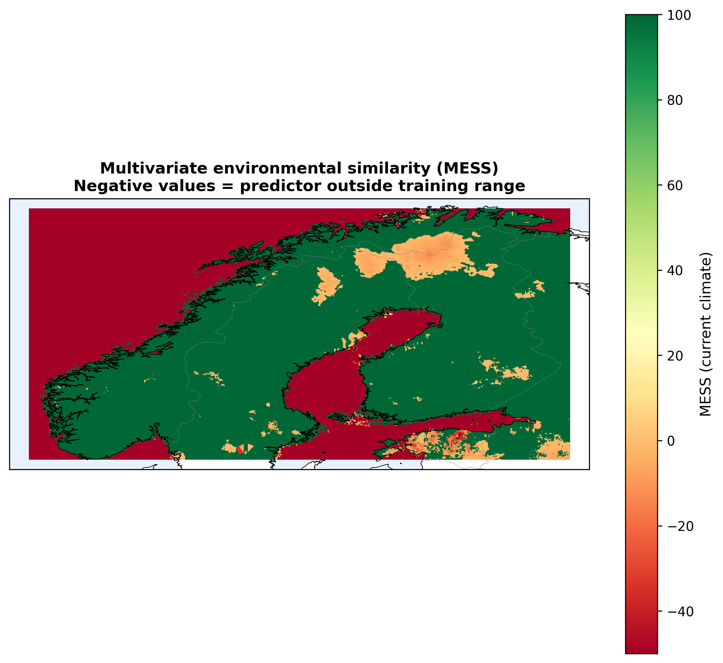
Figure 10: About 40% of Norway's pixels are outside the model's training envelope even in the present. These are mostly the high-elevation interior and far north, which are exactly the regions the future projections flag as "newly suitable by 2080."
I kept those pixels in the published maps rather than masking them out, because doing so would hide what the model is doing. But I produced the MESS map as a companion figure and acknowledge the caveat explicitly.
Good ML pipelines don't hide where they're guessing. They draw a map of it.
Sanity check: does the background sample size matter?
A recurring concern with presence-only models is the chosen number of background points. I tested 5,000 / 10,000 / 20,000 / 50,000 with the same spatial CV and two algorithms.
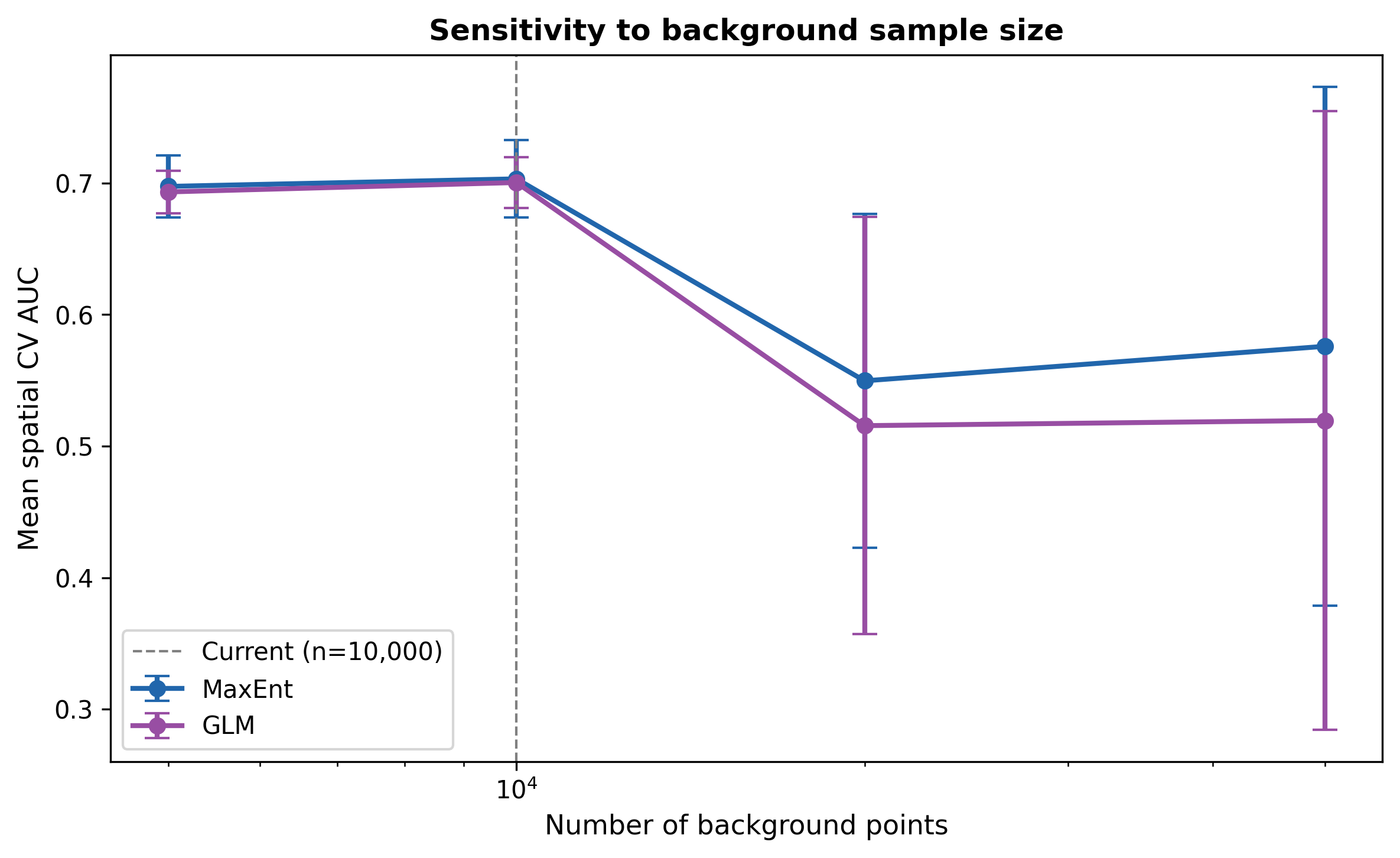
Figure 11: Performance is stable between 5,000 and 10,000 and then degrades at 20,000+. The degradation happens because the KDE bias weighting is finite. Adding more random points dilutes the correction and the model starts memorising geography instead of environment. 10,000 is the plateau.
Final scorecard
- Spatial-CV AUC (best: MaxEnt): 0.70 ± 0.03
- Spatial-CV AUC (worst: GBM): 0.63 ± 0.04
- Corrected Boyce (all algorithms): 0.90 to 0.98
- Dominant predictor (out-of-fold permutation): Mean T warmest quarter, ΔAUC = 0.15
- Current high-suitability area: ~20% of Norway
- Net expansion by 2080 under SSP5-8.5: +14% (25% gain, 12% loss)
- Net expansion by 2080 under SSP2-4.5: +17% (25% gain, 9% loss)
- Pixels outside training envelope (MESS < 0): ~40%
- Mean inter-algorithm SD: 0.21
What this project is and isn't
Is: a reproducible, honestly-reported multi-algorithm SDM with spatial validation, algorithm-agnostic importance, explicit uncertainty maps, a novel gain/loss decomposition of future change, and an extrapolation-risk flag. Any of the ten Python files in the repo can be run on any machine with the same seed and will reproduce the same numbers.
Isn't: a definitive prediction. AUC ≈ 0.70 is moderate. The ranking of regions is defensible, but specific pixel-level predictions carry real uncertainty. No dispersal or land-use predictors are included, so the maps describe the climatic envelope rather than where the species will physically reach by a given year. About 40% of Norway lies outside the training climate envelope, so those predictions are extrapolations.
The methodological takeaways (transferable beyond ecology)
- Use spatial cross-validation whenever points have coordinates. Random k-fold overstates performance on geographically clustered data.
- Always report a calibration metric alongside ranking metrics. AUC and Boyce (or Brier score, or calibration curves) measure different things.
- Compute permutation importance on held-out data, not training data. In-sample permutation inflates importance because the model has already memorised the permuted value's effect.
- Ensemble uncertainty is a map, not a number. The per-pixel SD across algorithms is a first-class output, not a throwaway.
- Decompose projections into their components. "Net change by 2080" hides whether the signal is driven by gain, loss, or both, and whether that signal is monotonic across scenarios.
- Flag where your model extrapolates. Every projection model extrapolates somewhere. Draw the map of it.
Try it yourself
The full code is in the GitHub repo. The notebook includes an "Appendix A" where you can type any Norwegian-invasive species name and get a fast version of the pipeline (MaxEnt + Logistic Regression, spatial CV, ensemble map) in about 3–5 minutes.
from quicklook import run_quicklook
result = run_quicklook("Heracleum mantegazzianum", country="NO")
Runs GBIF download → cleaning → bias correction → spatial CV → ensemble map end-to-end.
Stack: Python · scikit-learn · elapid · rasterio · geopandas · cartopy · matplotlib. Seed is 42 everywhere.